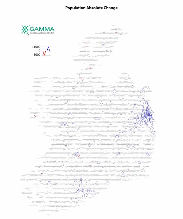
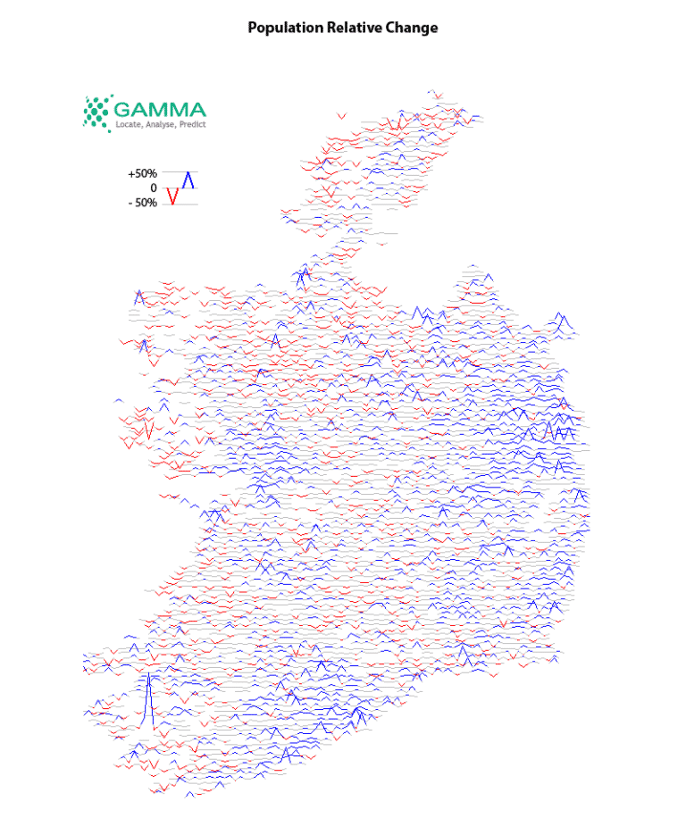
We added some history to last week’s population map, by comparing the figures from Census 2011 with the figures from Census 2016. We used colour to highlight changes of more than 100 people or more than 5% of the 2011 population.
Notice how the small absolute change along the west coast translates to a significant proportion of the 2011 population.
Gammais a Location Intelligence (LI) solutions provider; we integrate software, data and services to help our clients reduce risk through better decision-making. Gamma was established in 1993 and was the first company to develop LI for the private sector in Ireland. The company has expanded to become a global provider of cloud-hosted LI systems, micro-marketing solutions and related services.
")